LAUREN LOUISE DESIGN

HONORING THE PAST, BUILDING YOUR FUTURE

On The Boards

ON THE BOARDS: THE REDWOOD RETREAT KITCHEN

On The Boards, ShoppingLauren BraudComment
RedwoodTitle.jpg

Would you believe I had written this entire post just before quarantine? I was going to release it the following week knowing that in just about a month I would be flying back to San Jose to shoot this kitchen with Madeline and revealing the finished product to you shortly thereafter (we were planning to shoot this brand new bathroom too!). Instead, as we all know now, all of our flights were cancelled and life was put on hold. This project was one of my favorites from the last year not just because it has come together beautifully but because on the surface it appears we kept the original footprint of the kitchen. In reality there were a ton of seemingly small changes made in plan and in function that completely transformed the way this family can cook, enjoy and entertain in their home.

1 | Over the window sconces 2 | Chelsea Fly painting one & painting two 3 | New wood flooring 4 | New quartzite counters 5 | Benjamin Moore Classic Gray 6 | Cabinet Pulls 7 | Demijohn Pendants 8 | Storage Canisters 9 | Faux Piliea 10 | Delta Tri…

1 | Over the window sconces 2 | Chelsea Fly painting one & painting two 3 | New wood flooring 4 | New quartzite counters 5 | Benjamin Moore Classic Gray 6 | Cabinet Pulls 7 | Demijohn Pendants 8 | Storage Canisters 9 | Faux Piliea 10 | Delta Trinsic Faucet 11 | Farmhouse sink || Beautiful inspiration image credited to Park & Oak Design

As with any functional space, the real genius shines through in the floorplan. We swapped cabinet doors for drawers everywhere we could. At the peninsula we added an extra foot of countertop in both directions - adding bar seating on one side and book shelves on the end. We traded a standard depth fridge for a counter depth, and got rid of a weird shallow closet in the master bedroom hallway to add an extra foot to the kitchen overall - a seemingly small addition of square-footage that made a huge impact. Previously the homeowners kept a dog food container, a trash can AND a recycle bin out in the walkway - we tucked them away, each with their own cabinet.

S H O P K I T C H E N F A V O R I T E S

ON THE BOARDS: MY GUEST BEDROOM

On The Boards, Our First HomeLauren BraudComment
OTBGuestBedTitle.jpg

My heart and prayers go out to everyone affected by this pandemic. I hope that my blog can provide a place of lighthearted respite from the sickness, the worry, the home schooling and the stress. I am deeply grateful for those on the frontlines and to those staying home in hopes that they can to lessen the impact of this virus on our community. As a small business myself, I am thankful that you’re here, reading, and hope that you find something in this that entertains your soul if only for a moment.
Lets call this “Designing: Quarantine edition”. Our guest room has been many things since we moved in two years ago, guest room not being one of them (see this post on our little first home). This room has stored boxes of childhood memorabilia, a shocking amount of unopened mail, off-season clothes from our small master closet, endless amounts of old paper work I haven’t had time to deal with, etc etc. Well at this point, 30 or so days into staying at home, it seems I have finally had enough.
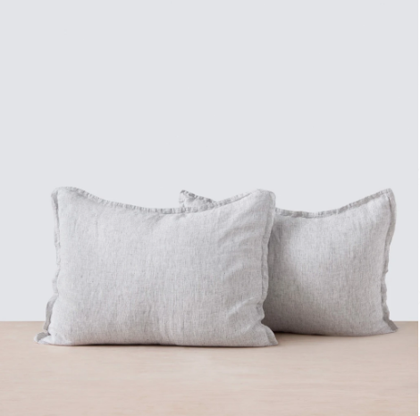
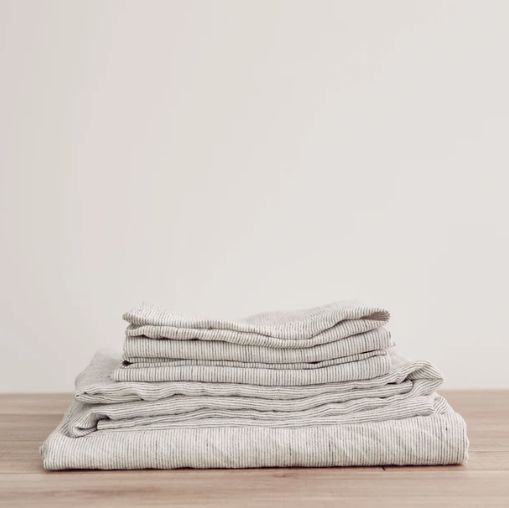
When the pandemic looked like it was going to hit in full, I decided we better order a mattress topper in case one of us gets sick and needs to sleep comfortably in a separate room. What happened next I often refer to with design clients as “if you give a mouse a cookie” syndrome. Well… the topper meant the fitted sheet didn’t fit so I had to get new sheets, and new sheets led to new pillows, and suddenly I have a new side table and I’m throwing some plug in sconces in a shopping cart. Folks I’m now in deep.

We live in a fairly small home by modern standards. At just 1250 SF we don’t have a ton of storage, and while I’ve been using some of my downtime to sort and organize and purge all the things we have been storing, one can only pare down so much and we just need more storage. You’ll see in the plan below that by getting rid of the door to the sad little closet and adding two wardrobe units in its place we will double the original closed storage we had this this room and I will finally have the window seat of my dreams!

I like the bed I have in there now, it’s a hand me down metal bed - but very modern with it’s soft grey powdercoated metal tubes. (This bed from Schoolhouse is the most similar I’ve found online). We will keep it for now but down the line I think I will want something a little warmer with a more defined headboard that can actually be seen over my obscene collection of throw pillows. Once my freestanding clothes rack is gone and all the clothes can be put away in the wardrobes I will have room for some seating at the end of the bed. Our house came with neutral berber wall-to-wall carpeting that isn’t the worst. If the right rug presented itself I wouldn’t be opposed to layering but for now I’m keeping it simple. The side table just arrived from Target (it was from Studio McGee’s Collection with Target) and it is even better looking in person, forewarning: the whitewash finish goes a little gray - I think it’s perfect but it does appear more warm in photos.

Cozy and warm guest bedroom design by Texas Interiors firm Lauren Louise Design .jpg

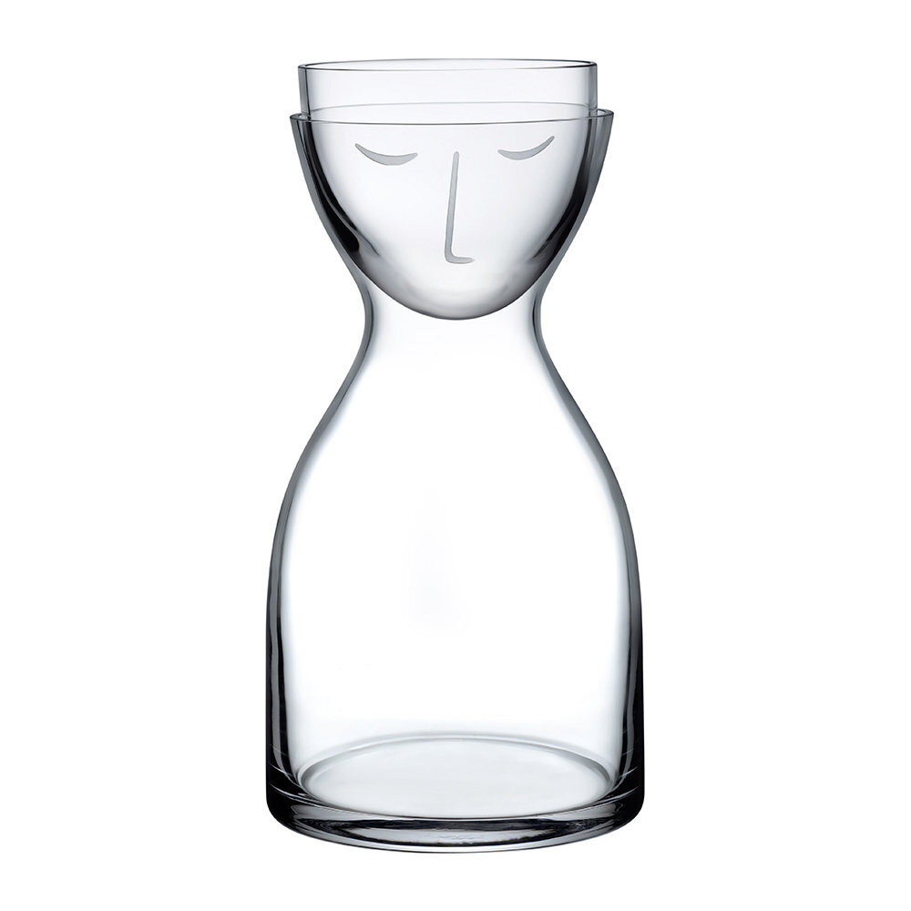
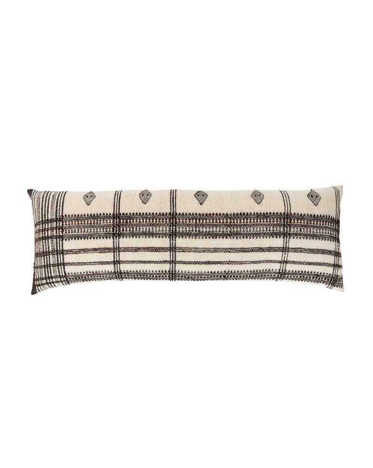
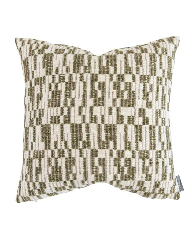
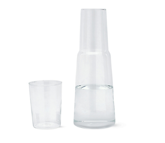
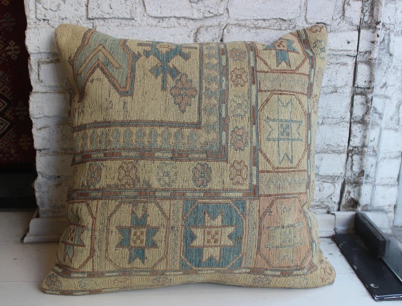
1 - My favorite ceiling fan | 2 - Offset Stripe Pillow | 3 - Batik Lumbar Pillow | 4 - 24x36 Oversized Birch Wood Frame | 5 - Coastline Print | 6 - Classic Gray by Benjamin Moore | 7 - My dream bedside sconces | 8 - The perfect minimal side table | 9 - End of bed benches | 10 - Water carafe | 11 - Plaid pillow | 12 - Cabinet Pulls | 13 - IKEA Pax Wardrobes

The guest room has been deemed our “quarantine project” and one of the two major things we want to accomplish inside our house this year, the second being our laundry room (remember this post, lol my priorities are constantly changing)- again to add more storage! Honestly I’m most excited about the little window bench seat. I’ll probably have the cushion made but I can’t wait to layer it with unique pillows and a pretty natural shade on the window.

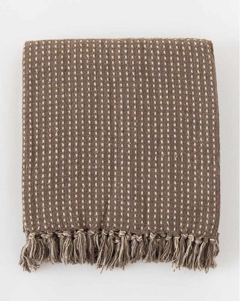
SHOP GUEST BEDROOM ESSENTIALS

Have you felt the itch to tackle home projects since you’ve been stuck inside? I would love to know what spaces you’re struggling with and anytime you feel like it’s all too much for one person to handle (or that your newly minted position as full time cook/home school teacher/work from home worker is more than enough thank you very much) don’t hesitate to reach out, I would be happy to get the ball rolling for you!


This post may contain affiliate links. This means I may make a small commission if you end up purchasing, at no extra cost to you. Please read my disclosure for more info.

ON THE BOARDS: A BEIGE TO BEAUTIFUL BATHROOM

On The BoardsLauren BraudComment
BraudBathTitle.jpg

This post contains affiliate links. I receive a small commission when you choose to purchase from my links, with no extra cost to you. Please read my disclosure for more info.

This bathroom was QUITE the transformation. This condo bathroom renovation was nothing short of life changing. As you can see in the layout below we made little tweaks that completely upgraded the function of bathroom. There were two closets in this tiny bathroom so we got rid of one and extended the counter all the way across; adding storage in the now-larger vanity. The second closet holds the water heater but is more than big enough for extra towels and toiletries. In the shower we added a little bench - angled slightly to allow the door to swing in. It worked out perfectly.

BathPlans.jpg

The before photos really tell the whole story. The bathroom was dark, yellowed…a little mismatched. Installing the new tile vertically on the shower walls gives the illusion of a higher ceiling. Limiting the colors and materials helps the room feel more cohesive. We also added two 4” LED can lights in the ceiling. Adding more (and better, more even) lighting was critical since there are no windows to allow daylight into this bathroom.

Before-Images.jpg

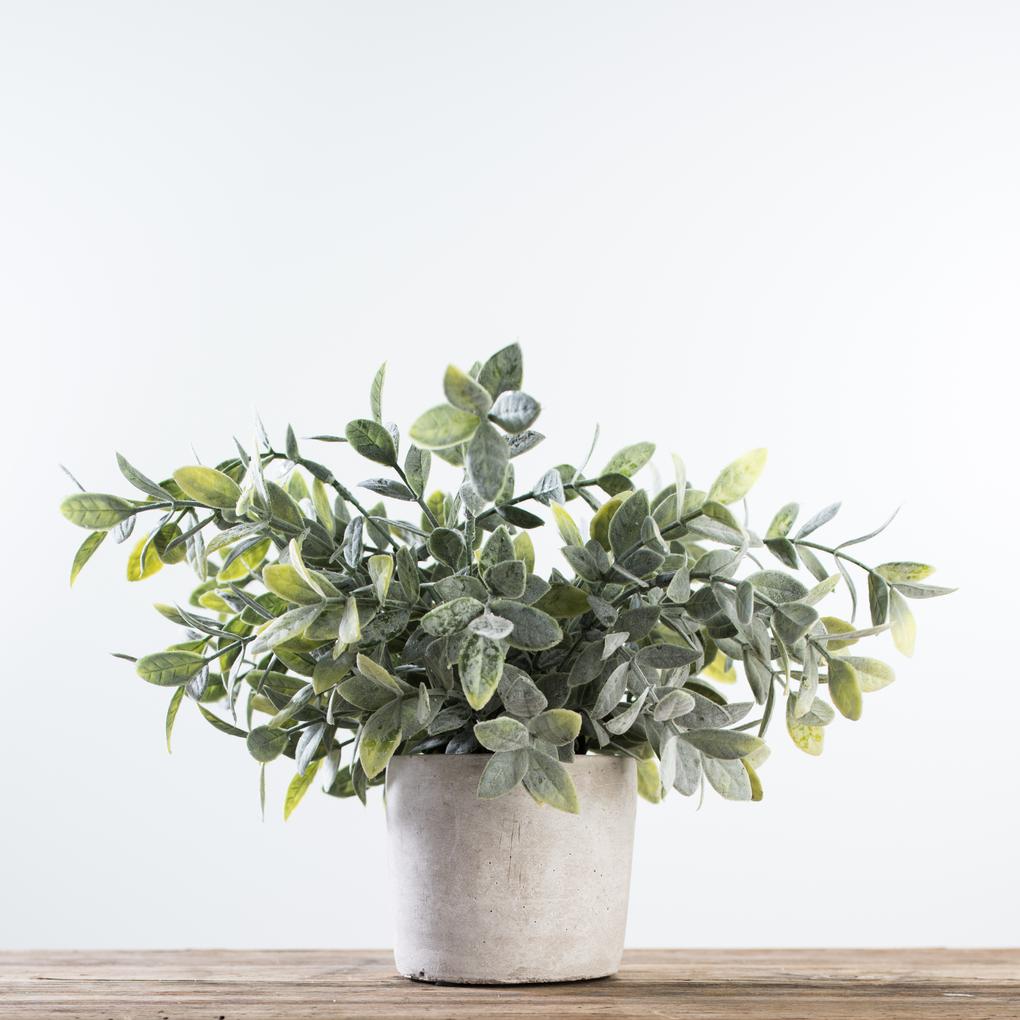
The overall palette is fresh, bright and clean with just a touch of glam. I love a spot of greenery in every room - but like I said, no windows - luckily leaps and bounds have been made in faux and I adore this soft sage from Magnoila home.

Paint Colors | Vanity & Trim: Benjamin Moore Revere Pewter; Walls: Sherwin Williams Snowbound

Paint Colors | Vanity & Trim: Benjamin Moore Revere Pewter; Walls: Sherwin Williams Snowbound

SHOP THIS POST

One of these days I’ll get professional pictures scheduled but this bathroom is finished and looking back on those before photos I think it’s safe to say this transformation has changed their life for the better.